Why p95 and p99 aren’t used in the 2026 Benchmarks
TL;DR: Our 2026 load tests are orchestrated by Orderly Ape, which outputs metrics aggregated into 10-second windows. Computing the 95th or 99th percentile over those aggregated windows gives you the 95th percentile of bucket-averages — not the 95th percentile of individual request response times. The two numbers can differ by orders of magnitude on a stressed server. So for 2026 we’ve dropped p95/p99 from the charts and from any ranking decisions. The averages (mean / cumulative average) remain accurate and are what the charts now use.
What “p95” is supposed to mean
When a load test fires a few hundred thousand HTTP requests at a server, each request has a response time. The p95 is the response time at the 95th percentile of that distribution — i.e., “95% of requests were faster than this”. It’s the standard way to talk about tail latency, because averages can hide spikes: a server that returns 200 ms most of the time but takes 30 seconds for the slowest 1% of requests has an OK average and a terrible p99.
This is why p95/p99 are usually the most important numbers in a load test report — they tell you about the bad days, not the typical day.
What we actually got from Orderly Ape this year
Orderly Ape collects per-request metrics from each k6 runner and then rolls them up into time-windowed aggregates — by default in 10-second buckets. The exported metric stream looks something like:
window_start       requests   avg_response   p95_in_window
00:00:00–00:00:10  4,812      181 ms         245 ms
00:00:10–00:00:20  4,901      183 ms         252 ms
00:00:20–00:00:30  4,778      189 ms         258 ms
...
That p95_in_window is the 95th percentile of the requests that happened inside that 10-second window. Useful for spotting one bad 10-second slice in a 60-minute test, but it’s a per-bucket value, not a global one.
When the downstream pipeline goes to compute a single “p95 for the whole test”, it does the only thing it can with what’s there: takes a percentile across the 360 bucket values (60 minutes × 6 buckets/min) instead of across the ~1.5 million individual request response times. That number has no useful mathematical relationship to the latency tail.
A concrete example of why this matters
Imagine 60 minutes of testing, 1.5M requests total, distributed roughly evenly across 360 ten-second windows.
- 358 of those windows go fine: avg response ~180 ms, in-window p95 ~250 ms.
- 2 windows hit a backend hiccup: avg response ~600 ms, in-window p95 ~1,200 ms.
True per-request p95 across all 1.5M requests: somewhere around 280–320 ms (the slow windows pull the global tail noticeably).
p95 of the 360 bucket values: around 251 ms — barely moved from the 358 “normal” buckets, because the 2 bad ones got smoothed inside each window’s own averaging and don’t represent enough of the bucket count to reach the 95th percentile of buckets.
A server with a real, painful tail latency problem looks indistinguishable from a server with none. That’s why we can’t use these numbers to rank or award.
What we use instead for 2026
- Cumulative average response time (
PageCumAvg, AssetCumAvg, LoginCumAvg, and the WooCommerce per-persona Cumavg metrics) — these are meaningful global aggregates of per-request response times, just reported as means rather than percentiles.
- Average response time (k6’s
AVG Response Time) — same story.
- Total requests / errors / peak RPS — still accurate.
For benchmark posts, awards, and tier rankings, those are the metrics we evaluate. p95 and p99 fields are still imported and stored on each result post (for future re-analysis if a fix lands), and are still displayed in the detailed results tables with an asterisk + footnote linking back here. They just aren’t charted, and they aren’t being used to award Top Tier or Honorable Mention status.
Comparing across years
If you’re looking at p95 values on a 2023 result and a 2026 result side-by-side, don’t. The 2023 numbers came from a different pipeline that computed p95 per-request, the 2026 numbers came from windowed aggregates. They aren’t the same quantity. We’ve kept the column visible across years rather than retiring it because the 2020–2023 numbers remain valid for historical comparison among themselves.
Does Price Give Better Performance?
Article originally published here.
Every year I publish WordPress Hosting Performance Benchmarks. But after publishing, I rarely get a chance to spend time really digging into the data. I’ve begun testing for 2019 WordPress Hosting Performance Benchmarks but before I finish them, I wanted to at least publish some analysis from 2018 that explores a fundamentally interesting question:
Does Price Give Better Performance?
The load testing results show that the more expensive WordPress hosting plans can handle a lot of traffic. But load testing isn’t the only metric measured during the tests; what about the other performance related measurements – how do they correlate with price?
A few notes to help understand the pricing structures. There are six price tiers I use for WordPress Hosting Performance Benchmarks: <25, 25-50, 51-100, 101-200, 201-500 and Enterprise (500+). This means all the plans in the price bracket cost somewhere in the specified range on monthly basis (in US dollars).
Uptime
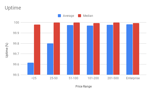
The uptime average and median percentages organized by price range. All raw data is available in the original blog posts. Since it’s a bit hard to see I’ll include the table used to generate this chart as well here:
| Price Tier ($/month) |
Average Uptime |
Median Uptime |
| <25 |
99.61566667 |
99.98 |
| 25-50 |
99.79958333 |
100 |
| 51-100 |
99.97666667 |
100 |
| 101-200 |
99.97 |
99.995 |
| 201-500 |
99.977 |
100 |
| Enterprise |
99.981875 |
99.995 |
What we can see is on average, there is a correlation between price and uptime. The median shows us that most hosts are capable of keeping servers online, but as you pay more, there are fewer issues too. Enterprise on average had a 99.98% uptime! That’s ~8 minutes of downtime per month average or if we use the median number of 99.995% then it’s ~2 minutes of downtime per month.
For perspective, the <25 average of 99.61566667% is roughly 2 hours and 48 minutes of downtime per month average, with the median being almost 9 minutes of downtime per month.
So in general, most companies stay online pretty well, but there also appears to be a positive correlation between price and uptime.
WPPerformanceTester PHP Bench Score
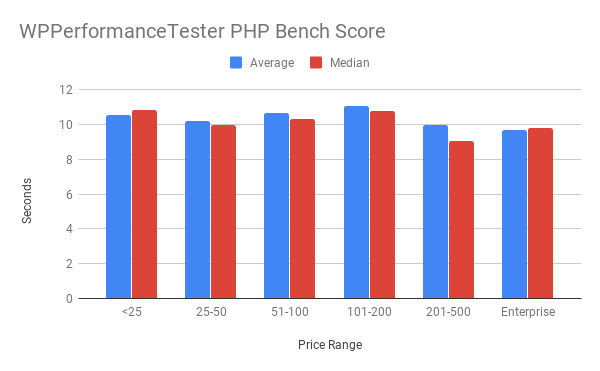
Lower scores mean faster server performance.
PHP Bench from my plugin WPPerformanceTester measures how quickly the server can do certain mathematical and string functions. This is designed to test the CPU on the server. More powerful CPUs should do this test faster. Mind you this is single threaded, so if your host has an architecture using a cluster of servers to handle requests, this isn’t an apples to apples comparison at all.
If we look at the results there appears to be a weakly positive correlation between price and performance. 201-500 and Enterprise have the lowest average and medians. There is a lot of variance here though with 101-200 looking like the worst alongside <25. It could be a sample size issue where that price range only had 5 plans. CPU speed isn’t perhaps the best measure of performance when looking holistically at WordPress performance, but it could be a tiny part depending on what you’re application does.
WPPerformanceTester WP Bench Score
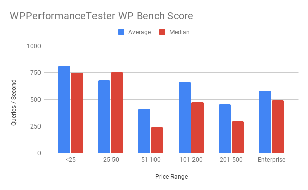
Higher scores mean faster execution of WordPress database queries
WP Bench Score is from the same plugin, WPPerformanceTester, and it measures how quickly the server can do certain WordPress functions (insert, select, update, delete) through $wpdb. This tests how quick the database queries are, using WordPress. This gets complicated because throughput can look very different on different architectures. When the database runs on the same machine as the web server, there’s virtually no latency and the scores tend to look substantially higher. On more complex and high availability setups with separate or multiple database servers, these scores tend to look lower.
If we look at the general correlation there appears to be an almost parabolic shape to the graph. The cheapest plans have the highest scores because most tend to run everything on the same host. The sample sizes start to shrink in the mid ranges, so I’m not sure how representative they are, but they make a performance comeback at the Enterprise level. Not as high, but higher than some of the middle tier. This could indicate better and/or faster servers but in a distributed environment. It’s hard to draw any meaningful conclusions off this test because of the way it works. But if I had to say something it seems like you get better performance that’s probably scaled out more as costs increase. Performance on this test also varies incredibly wildly. In the <25/month price range we had 181 to 1477 as the range of results.
Web Page Testing Results
Lower scores mean faster delivery of the web site to the testing location.
One important thing to note about comparing between price ranges is that I performed these tests grouped within price ranges. So the <25 tests should have all been done around the same time and Enterprise tests would be done at the same time. But that doesn’t mean <25 and Enterprise tests were done at the same time. They were only performed once (with 9 iterations on the test), but sometimes testing locations could be having issues, certain regions could be experiencing issues, it makes cross-comparing more difficult because the network conditions could vary more. If this were to be repeated and given a stricter testing methodology, multiple samples would be taken at as close to the same time as possible to make comparisons more valid. Most servers were also hosted in the US, but some were not, which would affect results especially in certain regions potentially.
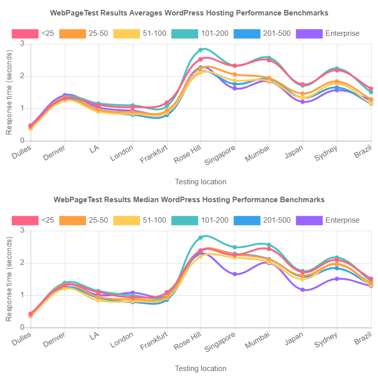
There does appear to be a loose correlation that the more expensive plans, on average, respond quicker around the globe. In the US, where most servers are located, that advantage seems a lot less pronounced. Some providers also seemed to perform out of the box better in general. At the Enterprise level, WordPress.com VIP consistently was the fastest winning the fastest speed in 9/11 different locations and coming in second by 22ms and 9ms respectively in the other two locations to Pantheon (who came in second fastest 7 times).
Conclusion
In general, there does appear to be a positive correlation between how much you pay and how much performance you get. This is somewhat reassuring that more expensive plans are actually adding value beyond simply serving more users. It’s not a rule at the specific host level and there are definitely some companies performing better than others. It raises further questions, are there a lot of less performant hosts in the lower tier that bring the averages down? Is there some sampling bias that compels more expensive companies that are competing for higher priced customers to only put their best foot forward? There are a lot fewer plans in the middle tiers with an uptick at the enterprise price tier. It’s hard to give a definitive answer, but as a whole, price seems to correlate with performance in WordPress hosting.
Bonus Charts #1 (Web Page Test Response Times by Year)
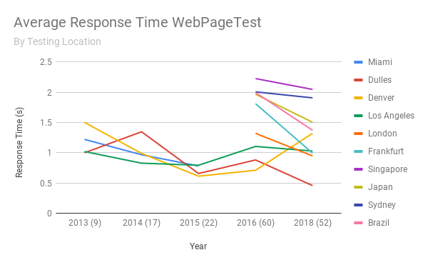
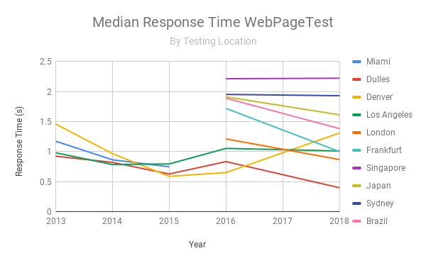
It’s really interesting to see that over time, on average, response times have gone down over the years from almost every location (what’s up with you Denver?). The parenthetical numbers by year are how many companies participated that year.